Butterfly
Man
Sketch &
Color Comp
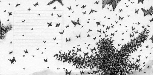
Sketch
This was another of the "immediate" images I saw when reading the text. Very few thumbnails.
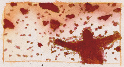
Color CompOriginally, I had a more naturalistic palette---you could see the butterflies more clearly---but it was lacking in drama. By darkening the values throughout, and making it more monochromatic, it make the image appear a little more ominous. I wanted the reader to be in John's shoes for a moment: He doesn't know what's happening to him or why. He doesn't know its going to be wonderful.
Previous Main Painting Next Painting
![]()
Email Order this Book F.A.Q. Reviews Butterfly Links Teachers Kids
johnclapp.com Children's Books