Shining Comps: An Explanation
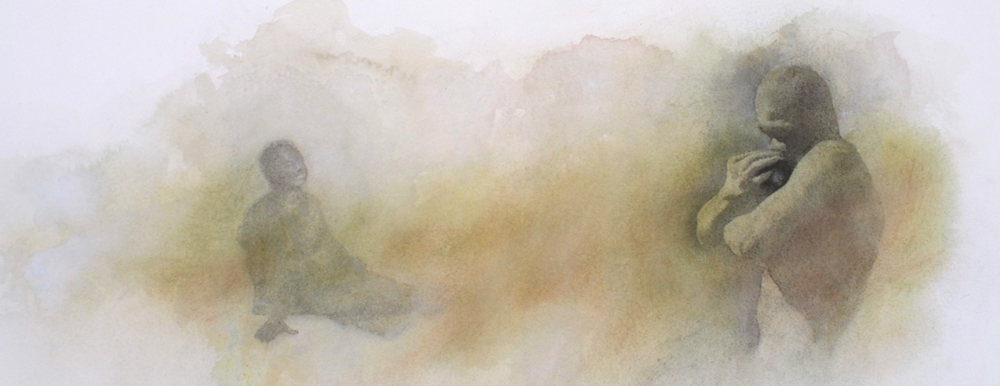
One of the more unusual things about this book, in terms of my process, is there was no B+W sketching stage----instead, I jumped straight into color comps. The reason is explained more fully in the "process" section of the site, but essentially I did it because I knew the book would depend on color to work the way I wanted, so I needed the information in the sketches from the beginning. The other really unusual thing about the book was how two of the comps actually ended up in the book as finishes!!! The good "qualities" of the sketches ended up being impaired by the process of working large and investing more time. The loose and fresh appeal of the comps worked far better than my finishes for those pages. When setting up the pages of color comps, I tried to size the images to the same dimensions so that a viewer could flip back and forth and see relative changes at different stages of the process---but this can also be misleading to a viewer. To that end, below are examples of the "Forgive Me" spread, shown in their relative sizes. Comps like this are done fairly quickly, 5 minutes to about an hour depending on the complexity, and are usually done completely out of my head with no reference materials. The idea is not to create a great painting as to communicate my general intentions to my editor. As such, I don't invest much time in individual pieces at this stage.
|
Color Comp vs. Painting (Shown in actual relative sizes)
 (about 9" wide vs. the 26" painting)